PIONEER HALL BRANDING PROJECT
CLIENT – PIONEER HALL, PORT CHALMERS
In a group of 3 we were given a client for a re-branding project in 2nd year. We spoke to the client, ran focus groups and shared information as a team, but we each had to design our own logo which was then put up for consideration with my team mates where the client picked the best logo to then enter the second half of the branding stage; Film and Advertising.
Unfortunately our client had a board of members and was slow to respond and the school decided to split our team up and join another group of our choosing.
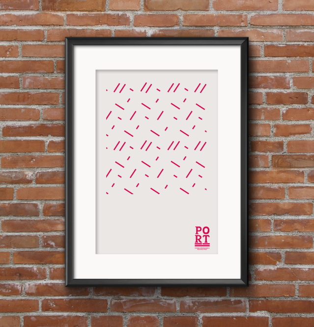
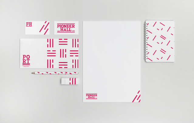
I ad a lot of fun designing the branding for Pioneer Hall, I took inspiration from the Art Deco style building and used the pen tool in Illustrator to create a typeface that matched the writing on the building.
I learnt that the letters on the facade were hand made as each letter was slightly different, especially on the E’s and the L’s, where the two were not the same. This added charm and a visual style that matched the community building that had been there for years.
I chose a deep pinkish red to reflect the love and warmth the community has for that building, I took inspiration from the 3 lines that wrap around the facade and incorporated it into the overall design aesthetic and brand, a familiar visual element with a contemporary flare added to make the design timeless.
I designed a graphics manual that I still need to acquire from the community hall for photographs, these will come shortly!